Pleasure in Ruins: Pluscarden Abbey in Postcard and Print

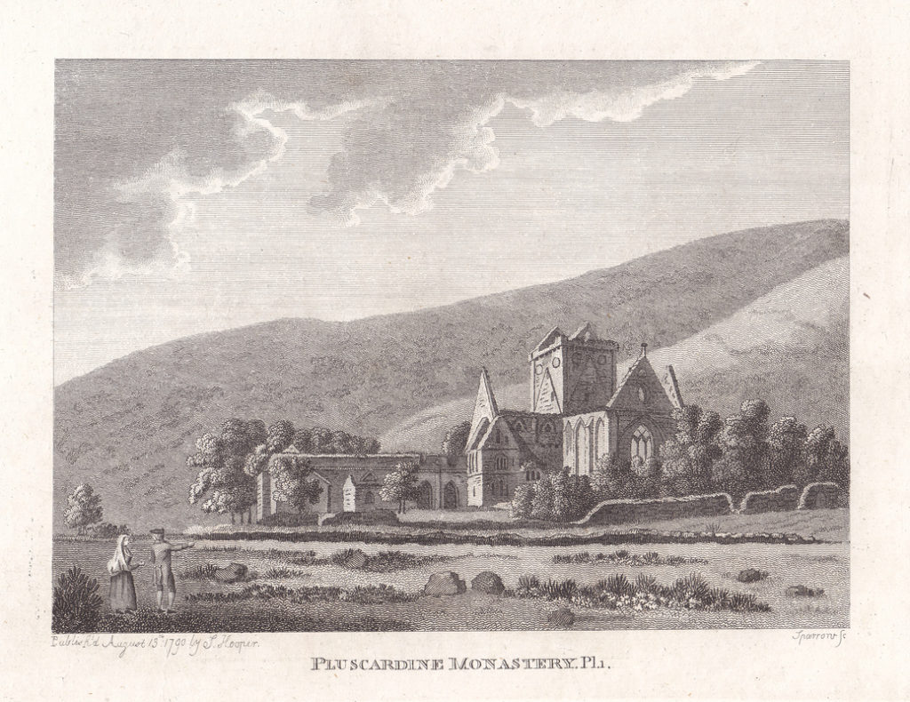
‘Pluscardine Monastery’ engraved in 1790 by Samuel Sparrow, from Francis Grose’s ‘Antiquities of Scotland’ Vol.II, (London: S Hooper, 1797)
Mark how the Ivy with Luxuriance bends
Its winding Foliage through the cloister’d Space,
O’er the green Window’s mould’ring Height ascends,
And seems to clasp it with a fond Embrace
George Keate, The Ruins of Netley Abbey (1764)Sometimes I wonder if there is some curious kink in human psychology that makes the sight of a crumbling, ivy-clad ruin more appealing to our eyes than a similar structure in pristine condition. Poets, antiquarians and artists have found ruins an almost endless source of material for their studies and meditations, offering a frisson of Gothic terror by moonlight or a moral exemplar for the vanity of man and the transience of earthly glories. After some time looking at old prints and poems about ruined abbeys and churchyards, one starts to recognise the recurring themes – sprouting foliage, owls in moonlight, skeletal cloisters, lonely figures hemmed in by overhanging walls and shadows. Even as 18th century travellers give way to Victorian tourists, and engravings yield to Kodak prints and tuppenny postcards, the same picturesque conventions persist.Today’s blog presents a brief survey of images of Pluscarden Abbey, which was abandoned after the Reformation and remained in a ruinous state for some 350 years. Being somewhat off the beaten path it was never subjected to the intense scrutiny of monastic ruins such as Fountains or Rievaulx, but the 25 pictures below (all scanned from prints and postcards in my collection, apart from the Girtin watercolour) will hopefully offer some insight into the way in which a single structure has been depicted by artists and photographers over a period of 150 years.
John Claude Nattes was a founder member of the Society of Painters in Water Colours in 1804, two years after Girtin’s death. The Society broke away from the Royal Academy, who did not accept watercolour painting for its exhibitions. If Nattes ever executed watercolour paintings of Pluscarden, they have not survived, but the delicacy of these pencil sketches is still impressive.

Picture

‘Inside View of Pluscarden’, drawing made on 7 October 1799 by John Claude Nattes
Thomas Girtin’s watercolour shows the view from the opposite side, looking from the north west through the ruined cloisters towards the walled-up arch that would have connected to the nave. Before Girtin, watercolour had been regarded as suitable only for preliminary sketches and not a suitable medium for serious landscape painting, far less Academy exhibitions. Girtin changed all that with his evocative paintings of ruined monasteries, beginning the Romantic tradition of watercolour landscapes.

Picture

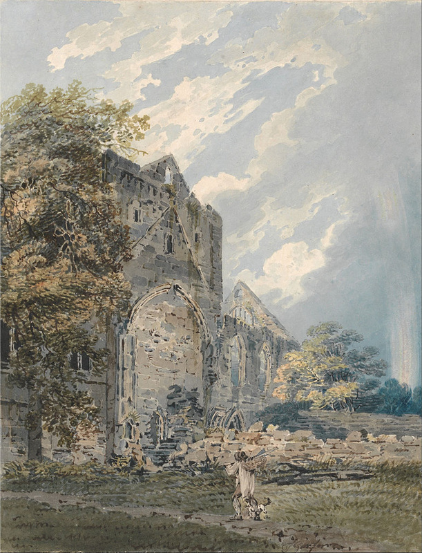
‘Pluscardine Abbey,Elgin’ (1793), watercolour by Thomas Girtin. The original painting is now in the Yale Center for British Art, New Haven, Connecticut.
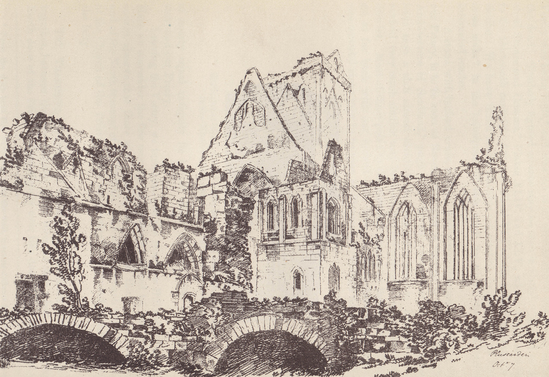
This view of the ruined monastery from the SE takes a few liberties with both the setting and the structure, such as exaggerating the height of the hills. Grose wrote ‘This Priory stands on the North side of the River Lochty, about six miles South West from the town of Elgin, near the entry of the valley, at the foot of the North hill, which reverberating the sun beams, renders the place very warm.’ This sense of pleasant weather – the engraving is dated 13 August 1790, so presumably a summer’s day – is matched by the open aspect and bright airy feel of the view.
Another Nattes drawing from the same day, showing the undercroft which was later filled in.

Picture

‘Pluscardine Abbey’ engraved by James Fittler from a drawing by Nattes, from ‘Scotia Depicta’ (London: W.Miller, 1804)
Fittler’s engraving introduces various picturesque elements that are absent from Nattes’ more precise drawings: a gloomy sky, thick foliage not only framing the view on both sides but overhanging slightly to convey a sense of of nature’s ability to overpower the works of men, and some human interest in the form of a lone walker with a dog at his feet, leading his horse through the ruins.

Picture

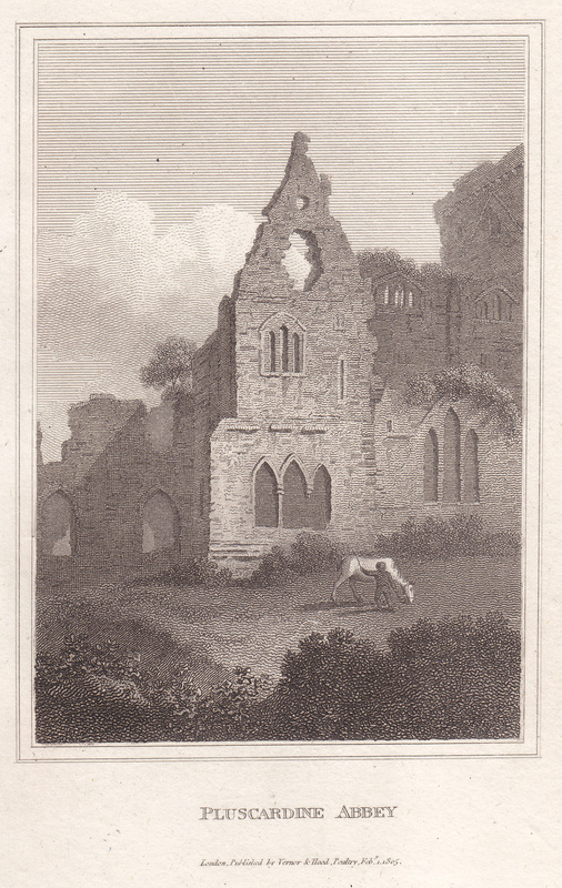
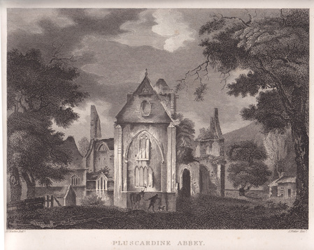
The work of an unknown artist, published 1st February 1805 by Verner & Hood. This view shows the east end of the Lady Chapel, although its height has been exaggerated for dramatic effect.

Picture

From John Stoddart, ‘Remarks on Local Scenery and Manners in Scotland in the Years 1799 and 1800’, (Vol.II) London: John Miller, 1802
This print also introduces the figure of man and horse – a typical pastoral image. Pictures of ancient ruins often showed shepherds or cowherds grazing their animals – a reference to Biblical prophecies such as Isaiah 5:17 and 7:25, which warned that cultivated places would one day fall desolate and be fit only for animals.
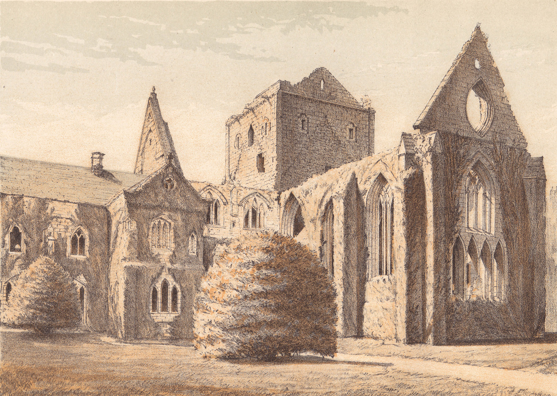
The monastery is roofless in all these views, but James Duff, the 4th Earl of Fife and owner of Pluscarden from 1811 to 1857, was the first to carry out major renovations. His concerns were domestic rather than religious: the dormitory was re-floored in the 1820s to allow dancing, and the ground floor rooms were fitted up for use by shooting parties. The local Presbyterian kirk began worshipping in the monks’ chapter house (below) where they installed a 17th century pulpit from Elgin.

Picture

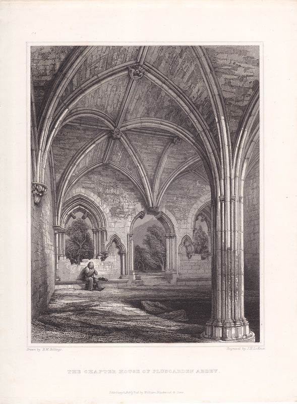
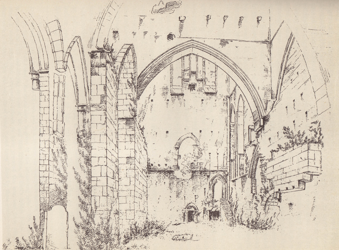
The Chapter House, Engraved by Robert W. Billings and Engraved by John H Le Keux for Vol. IV (1852) of ‘The Baronial and Ecclesiastical Antiquities of Scotland’
Billings’ accurate and detailed drawings still retain elements of Romantic sensibility – note the lone figure with lowered head, his gaze directed towards the gravestones in the floor. Reflecting upon one’s own mortality and the inevitable passage of time was one purpose of visiting ruins.

Picture

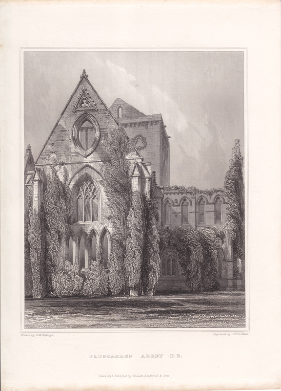
View from the NE, showing the extent to which the ruin were clad in ivy. – Billings & Le Keux (1852)

Picture

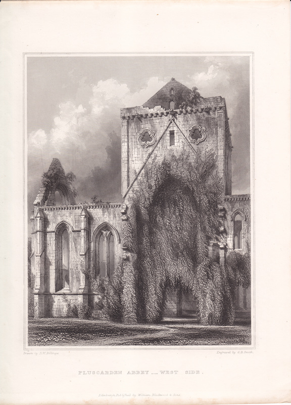
View from the West Side, – Billings (1852), engraved this time by George Belles Smith

Picture

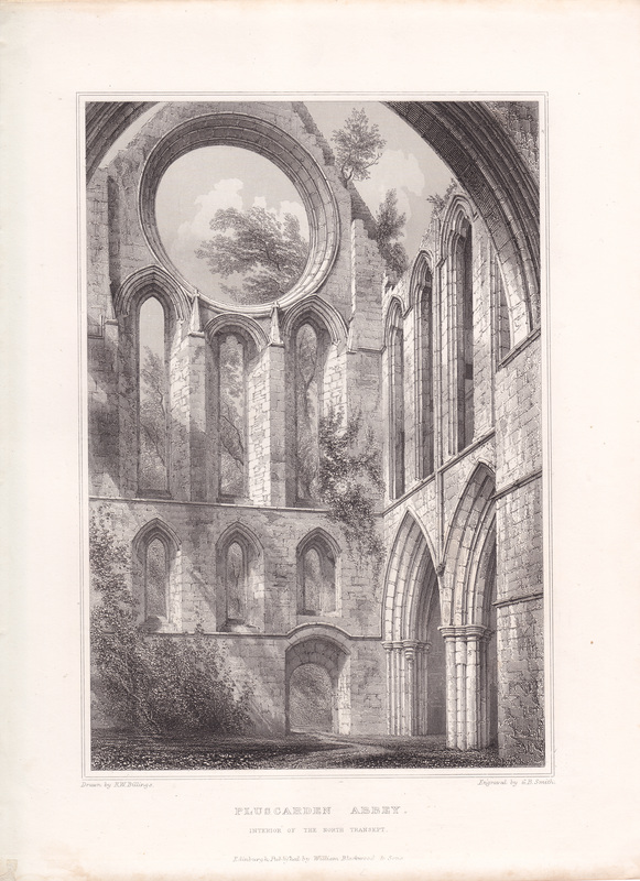
Interior of the North Transept, Billings & Smith (1852.) Here, the large rose window is shown entirely open, whereas the photographs below show that it was in fact partially bricked up.
Pluscarden remained in the hands of the Earls of Fife until the end of the 19th century, by which time they had moved further up the aristocratic scale: the 6th Earl became the 1st Duke of Fife after marrying Queen Victoria’s grand-daughter, Princess Louise, in 1889. By this time the ruined monastery had become a popular visitor attraction for daytrippers and Sunday picnics on the lawn, for which a small admission charge was paid at the gate.

Picture

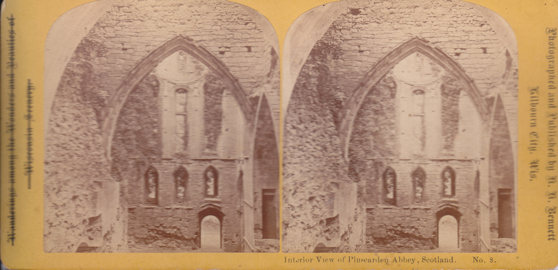
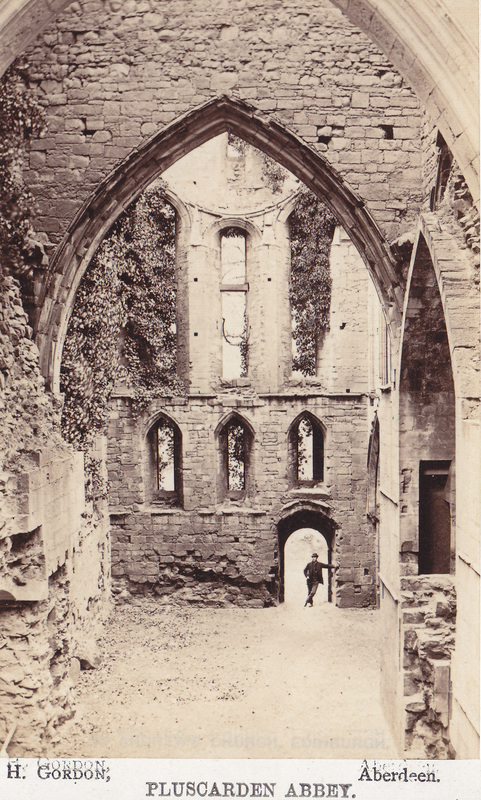
Stereoview showing the interior of the north transept, taken from beneath the central tower. Published and photographed by H H Bennett, Kilbourn City, Wisconsin.

The print on this stereocard claims that this view was ‘published and photographed’ by Henry Hamilton Bennett (1843-1908), a pioneering photographer from Kilbourn City, (now Wisconsin Dells) in Wisconsin. At the other end of the card, the title ‘Wanderings among the Wonders and Beauties of Wisconsin Scenery’ – also printed in Gothic blackletter type – has been scored out, and ‘Interior View of Pluscarden Abbey, Scotland, No.8’ printed in a different typeface underneath.

This puzzled me, as I didn’t think Bennett had ever travelled to Scotland. Thankfully, Alan J Hanson, the Historic Site Co-ordinator of the Bennett Studio in Wisconsin (which has preserved Bennett’s studio and photographs) was able to help. It appears that Bennett’s mentor
Milwaukee industrialist William Metcalf – came over to Scotland and either took the photo himself or commissioned a local photographer to do so, and then sent the negative back to Wisconsin for Bennett to print. These would then be sold alongside Bennett’s images of the scenery around Wisconsin Dells, which were very popular with tourists. The image is very similar to that taken by Henry Gordon (below.)

Picture

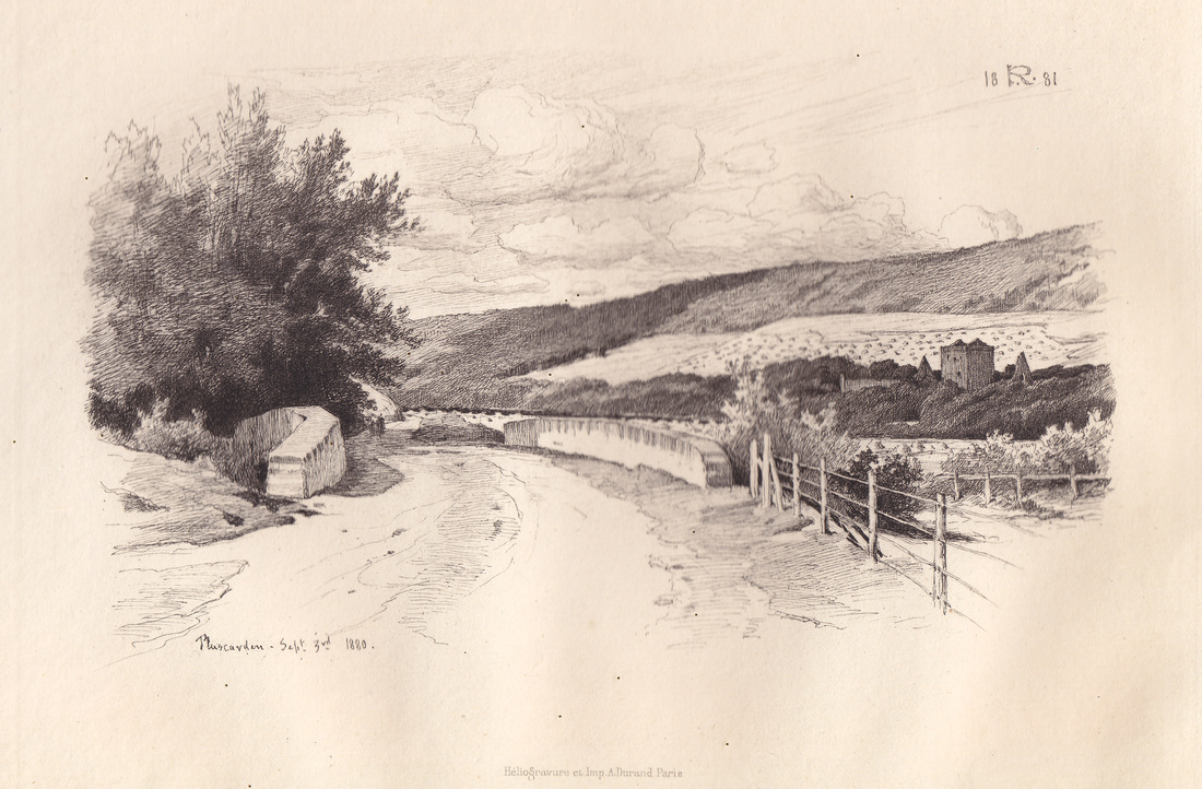
Pluscarden, 3rd September 1880. Heliogravure print by Armand Durand (1831-1905), possibly from an original pen drawing by Sir George Reid F.S.A. (1841-1913)
This print shows the view when approaching from Elgin, with Heldon Hill and the Monaughty Woods rising up on the north side of the monastery.
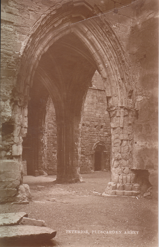
This little carte-de-visite was the work of by Aberdeen photographer Henry Gordon,.probably in the 1880s The view is from under the main tower, looking down from the dormitory staircase towards the north door.
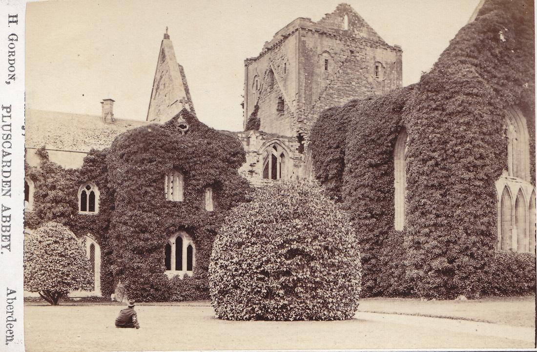
Another cdv-sized photograph by Henry Gordon, who had premises at 3 Belmont Street (1876-1887), 92 Rosemont Place, (1883-1895), 45 School Hill, (1887-1890) and 38 St Nicholas Street (1893-1900), all Aberdeen. The carefully pruned shrub indicates how much the grounds had been domesticated and gentrified, in comparison with the appearance of the 18th century prints.
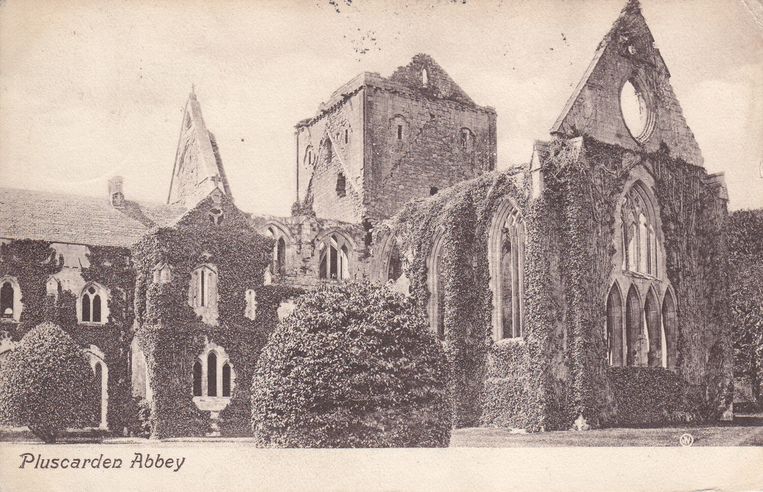
This view, taken around the same time with a camera set up in almost the same spot as Henry Gordon’s, was published by James S. Pozzi, author of a Guide to the Ruins of Elgin Cathedral (Elgin, 1892)

Picture

Frontispiece to ‘The History of the Religious House of Pluscardyn’ (Edinburgh: Oliphant, Anderson & Ferrier, 1881) by the Rev Simeon Ross Macphail.
The above picture is clearly derived from the photograph reproduced on Pozzi’s postcard, rather than Gordon’s which shows much thicker ivy. Macphail’s book was the first major study of the history of the monastery, and – despite being a Free Church minister with a strong antipathy towards Roman Catholicism – his work combined careful scholarship with a sense of deep affection for the place. It remains unsurpassed, notwithstanding the publication of Peter Anson’s A Monastery in Moray (London: SPCK, 1959.)
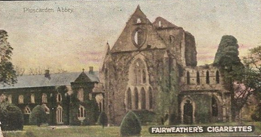
A nicely-coloured cigarette card, from the late 19th century: No.4 of ‘A Series of 50 Historic Buildings’ issued by Fairweather & Sons, a tobacco company founded in Dundee in 1835. Despite this constant reference to ‘Pluscarden Abbey’, the monastery was never more than a priory in medieval times. Its first ever abbot was not elected until 1974.
In 1897 the priory and estate of Pluscarden were purchased by John Patrick Crichton-Stuart, the Third Marquess of Bute (1847-1900.) A great patron of the art and a serious antiquarian scholar, he had plans to restore the priory over a ten-year period at a cost of around £200,000. Under the direction of architect John Kinross, excavations were undertaken, work began on the church, and a team of artists, craftsmen and masons were hired.
These two postcards were has taken from more or less the same spot, at slightly different times of year, and show the first stages of restoration: the removal of the dense layers of ivy which had been regarded as so picturesque by past generations. Nothing of course, was quite as romantic as viewing the ruins by moonlight….

Picture

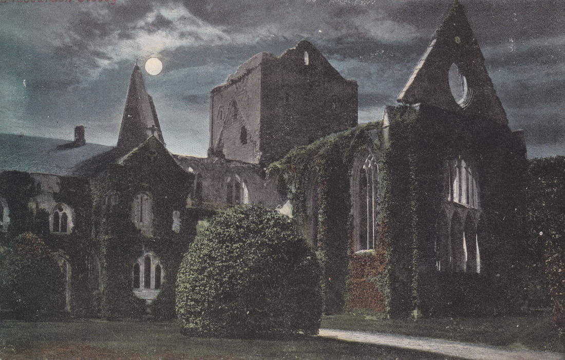
Pluscarden by Moonlight. A tinted version of one of the view above
The death of the Marquess in 1900 brought work to an abrupt halt.
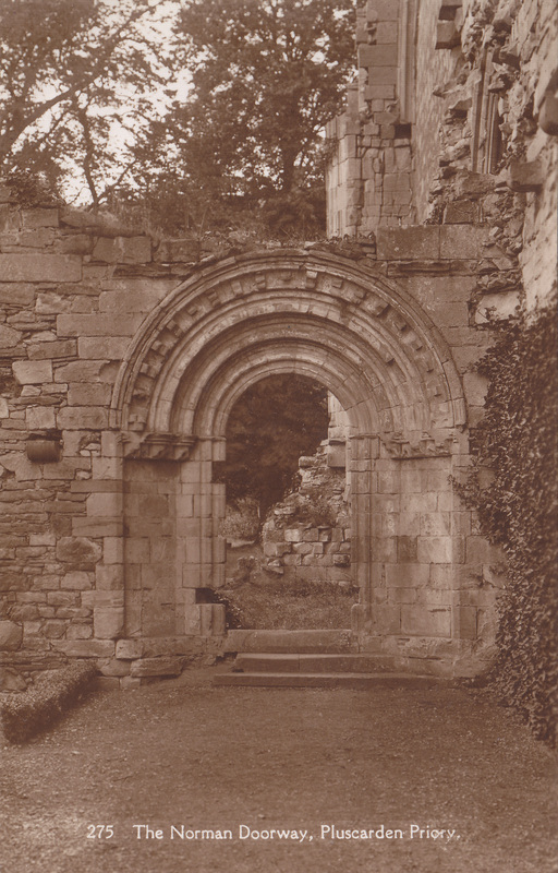
Nevertheless, the grounds were now in excellent condition, and this postcard shows the neatness of the pathways leading around the ruins. Prior to the Reformation, construction of the monastery had continued over three centuries, incorporating a variety of historical styles; this archway is actually a later medieval imitation of an earlier architectural style. Going for the ‘retro’ look is nothing new.

Picture

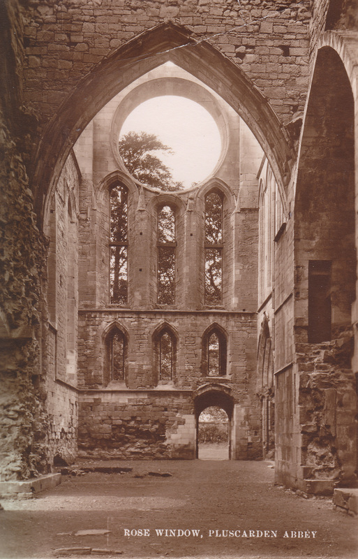
Another postcard view of the rose window and north door

Picture

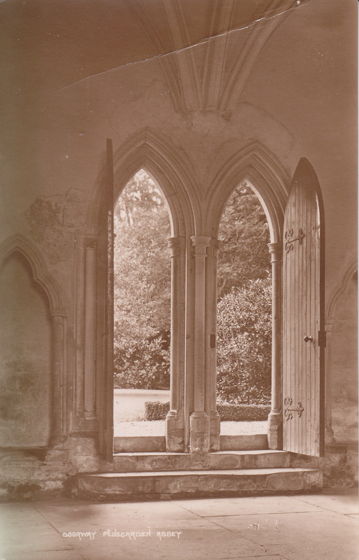
From the same set ca.1900 looking towards the entrance door to the Lady Chapel

Picture

Another postcard view, this time taken from inside the calefactory and looking out into what would have been the cloister garth

Picture

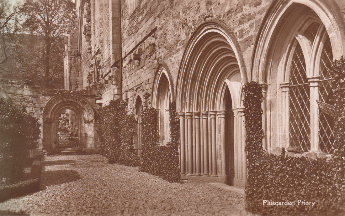
The same doorway from the other side, showing the neat gravel paths and hedges that had been laid out in the priory grounds. The Norman archway is visible at the end of the path.

Picture

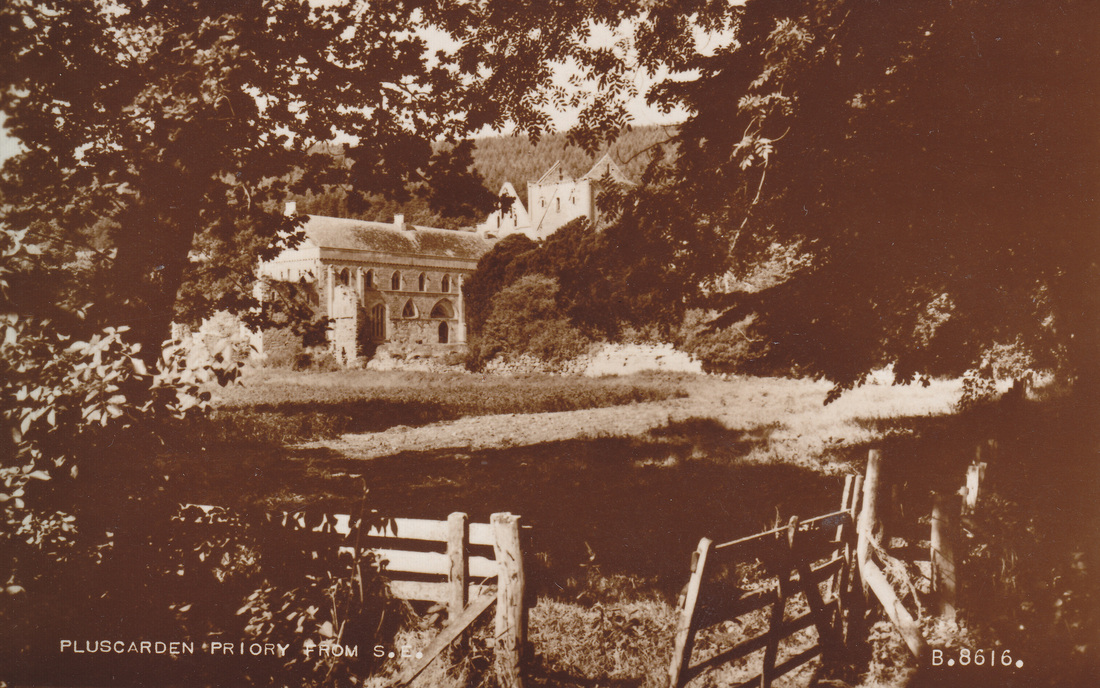
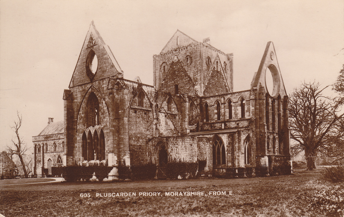
Pluscarden Priory from the SE. Postcard printed by Valentine & Sons Ltd
This picture has been taken from the SE, a short distance from the Elgin road, and uses a typical ‘picturesque’ technique of framing the view through foliage. Founded by photographer James Valentine in 1851, Valentine’s was probably the largest manufacturer of picture postcards in Britain by the end of the 19th century.

Picture

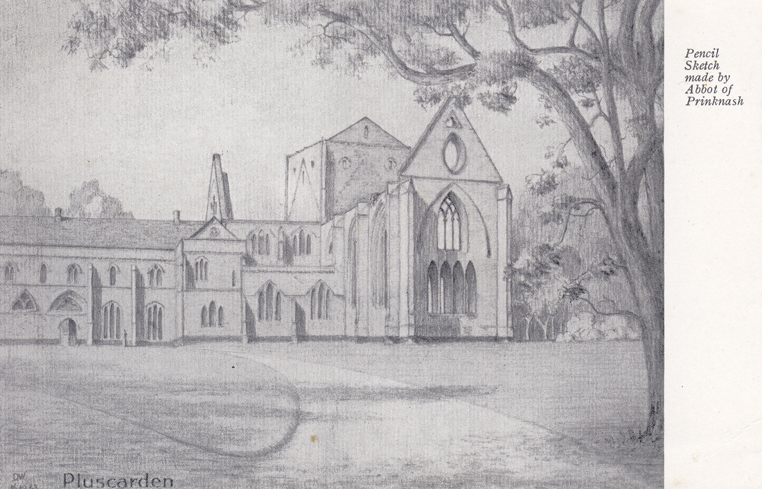
Pencil sketch of Pluscarden by Wilfrid Upson OSB, Abbot of Prinknash, in 1943, the year the priory was handed over to the monks of Prinknash Abbey

After the death of the Marquess of Bute, Pluscarden passed to his youngest son Lord Colum Crichton-Stuart. Ownership of the huge building was something of a burden – he was liable for the upkeep and had no wish to live there himself – and he was therefore keen to find a religious community who could take it over. Benedictine monks were the natural choice, as it was Benedictines who had lived here prior to the Reformation; he shared his father’s liking for ‘authenticity’.

Lord Colum visited Caldey in 1921 and made the offer to Abbot Aelred, who felt unable to accept. When Lord Colum repeated his offer in 1935, the community again declined. It was a case of third time lucky, as by 1943 Lord Colum had decided that if no monastic community was willing to take it on, he would have to hand Pluscarden over to the state. The above sketch was drawn in 1943, the year that Abbot Wilfrid finally agreed.

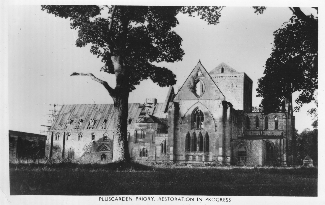
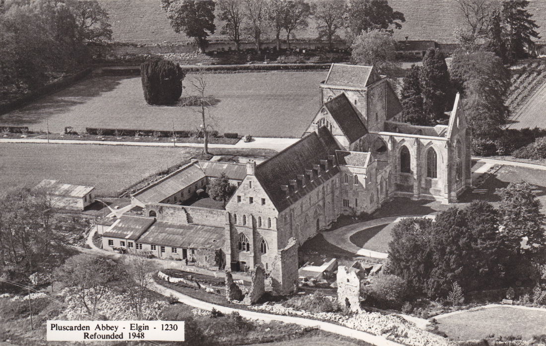
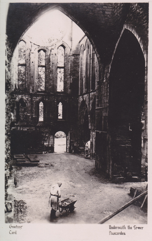
Practical moves had to be delayed until the end of the war, of course, but in 1945 arrangements began to be made. Architectural surveys were carried out, plans drawn up, historical research carried out. Five monks were sent in April 1948 to begin the work of restoration, and within four months the buildings were habitable enough to allow an official opening Mass on 8 September 1948.
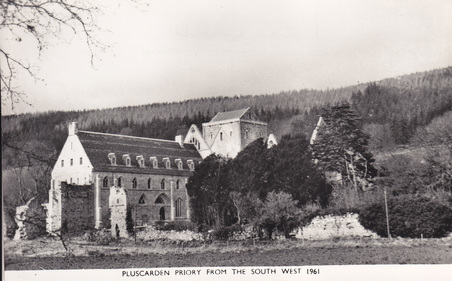
By 1961 restoration work had made considerable progress, and as the buildings became less ruinous, they begin to drift beyond the scope of this post. There will come a moment – at some distant point in the far future – when the structure will once again crumble and fall, and its ruinous state will be restored. But by that time I will have long ago laid down my pen.

Rodney Hubbuck’s Architectural Visions

Most of the last fortnight has been spent reading and writing on architectural photography in relation to Victorian church restoration, linking up with the other religious and aesthetic themes that are central to my thesis. After poring over old volumes of The Ecclesiologist and original letters from SPAB members, well-known classics such as Charles Eastlake’s History of the Gothic Revival and spirited protestations by William Morris, plus the usual mounds of secondary works and periodical literature, I derived a keen pleasure from these fifty year old drawings by Rodney Hubbuck.

A Tower, after Sir Gilbert Scott’s Tower at All Soul’s, Leeds
Born in Hindhead, Surrey in 1940, Hubbuck developed his interest in architectural drawing while at school at Frensham Heights, a forward-thinking school in Farnham. After further training at Portsmouth School of Art (1957-61), he spent a few months as a prospective artist in the office of architects John Seely & Paul Edward Paget, before returning for further studies at the Bath Academy of Art at Corsham and then Brighton College of Art. He then took up the post of assistant art master at Bradford Grammar School.

Picture

Through a Needle’s Eye: an imagined approach to the London, Brighton and South Coast Religion
His deep understanding of Victorian church architecture – both the structure and the history – is evident from these drawings; like most of his work, they appear to have been executed in soft lead pencil. The curious juxtapositions have an element of fantasy about them, while – to my mind – also offering a wry commentary upon the anachronistic work carried out by well-meaning Victorian restorers.

Picture

The Old Church Supplanted
Hubbuck subsequently left Bradford to become a full-time artist, although he also occasionally wrote on architectural subjects: he co-authored with Nikolaus Pevsner the volume on Hampshire: Winchester and The North (1967) for the Buildings in England series, and published a pamphlet on Portsea Island Churches (1969, revised in 1976.) He now lives in Dorchester, where I’m going in a few days time. Sadly, I realised today that I’ve just missed an exhibition of his work that was being shown earlier this summer. In his masterly use of the pencil and profound grasp of architectural detail, his skill matches that of one of my other featured artists, Joseph Pike – but how different are their styles!

Cleavage and the Code: a study in cinemorality


Following on from my previous blog on Abbot Wilfrid Upson’s visit to Hollywood – ‘A Monk and His Movies‘ – I wanted to expand a little on his comments about the difference between British and American views on censorship.

The one film that earned the abbot’s ire was Forever Amber (1947), a racy Restoration romp based on Kathleen Winsor’s 1944 novel about the exploits of Amber St. Clare (played by Linda Darnell, who never looked lovelier.) Having been brought up in the repressive Puritan village of Merrygreen, Amber runs off to London and hops from one bed to the other, ascending the social ladder with every conquest until she becomes the mistress of Charles II.

Picture

The reputation of the novel was such that its transfer to the screen was dogged with controversy from the outset. The trouble lay not so much with the visual content as with the lack of any moral condemnation of Amber’s actions, while her opinions – e.g. ‘Adultery is not a crime, it’s an amusement’ – appalled The Legion of Decency, who threatened to rate it a C (condemnation) unless significant changes were made. Father Patrick Masterson (whom Abbot Wilfrid met in Los Angeles) arranged a meeting with the director and 20th Century Fox officials in October 1947, and negotiated a compromise that saw him write a prologue for the film – read as a voice-over – in which the Catholic view was stated clearly: ‘This is the tragic story of Amber St. Clare, slave to ambition, stranger to virtue, fated to find the wealth and power she ruthlessly gained wither to ashes in the fire lit by passion and fed by defiance of the eternal command – the wages of sin is death.’

Picture

This dire warning did nothing to deter cinema audiences from watching Amber’s on-screen exploits, and she was not the only rebellious, scheming, cross-dressing Restoration heroine found on cinema screens in the 1940s…
Daphne du Maurier’s novel Frenchman’s Creek (1941) was made into a Paramount movie in 1944 and told the story of Lady Dona St Columb (Joan Fontaine, above, in her second Du Maurier film) whose love for a French pirate has her disguising herself as a cabin boy, betting, and wielding a knife, amongst other activities not expected of an aristocratic lady in 17th century Cornwall.

Although the gorgeous colour and lavish costumes of Forever Amber and Frenchman’s Creek make the films very easy on the eye, both of them seem excessively long and not nearly as much fun as they should be. This cannot be said of The Wicked Lady (1945), a film adaptation of Magdalen King-Hall’s The Life and Death of the Wicked Lady Skelton, which had been published earlier that same year. Loosely based on the life of Lady Kathleen Ferrers, it starred Margaret Lockwood as Barbara Skelton, who opens the film by stealing the groom of her best friend Caroline (Patricia Roc) at the altar. (Roc also supported Lockwood in Love Story (1944) and Jassy (1947), slapping her face in all three films.)

Bored with married life as the lady of the manor, Barbara starts dressing as a highwayman and carrying out armed robberies at night. During one such escapade she meets notorious highwayman Jerry Jackson (James Mason), and the two become lovers as well as partners in crime. Inevitably, their exploits catch up with them, Caroline gets her revenge, and the gallows beckon for at least one of the wicked pair…

Margaret Lockwood clearly relished the part of Lady Barbara, and audiences loved her performance. Gainsborough melodramas excelled in such bodice-ripping productions, with lavish costumes and Gothic settings. Unfortunately, when the film crossed the Atlantic in 1946, the American censors were upset by what they saw.

Although it had not been a problem in Britain, the low-cut costumes worn by Margaret and Patricia exposed rather too much flesh for American tastes, and in consequence, Lockwood and Roc were called back to Gainsborough Studios at the end of August so that certain scenes (such as the two ladies bouncing along in a coach on their way to Tyburn) could be re-shot from different angles. This was a tedious and costly business, as – to ensure continuity – both actresses had to replicate gestures and expressions, while props needed to be reassembled in precise positions. Decorative frills and ruffles were added to Elizabeth Haffenden’s beautifully-designed costumes to cover up any bare flesh, and one of Lockwood’s dresses had to be borrowed back from Hermione Gingold who was using it a sketch in her satirical revue Sweetest and Lowest at the Ambassadors Theatre. Gainsborough resented the tiresome and costly fuss, but it succeeded in generating a great deal of publicity that gave the film a new lease of life at the box office.

The studio, of course, needed to accept the distributors’ demands in order to have The Wicked Lady shown in the U.S.A. In outlining the nature of the problem, officials at the MPAA devised a new word, ‘cleavage’, which replaced the old-fashioned ‘décolletage.’ How they came up this word I do not know; perhaps the answer can be found in original papers held in the MPAA archives? As a youngster I used to wonder why the Bible (in the King James Version with which I grew up) had the line: ‘Therefore shall a man leave his father and his mother, and shall cleave unto his wife: and they shall be one flesh’ – which suggested two things cleaved together – when everyone knew a meat cleaver cut things in two. I’ve still never really understood that, but the OED defined ‘cleavage’ as ‘The cleft between a woman’s breasts as revealed by a low-cut décolletage,’ and stated that the first use of the word was in an article in Time magazine on 5 August 1946, which I give in full below.


[Note: The ‘Johnston Office’ is a reference to Eric A Johnston (1896-1963) who succeeded Will H Hays in 1945 as president of the Motion Picture Producers and Distributors Association. Understandably, one of his first actions was to simply the organisation’s unwieldy title to the Motion Picture Association of America.]

Cleavage & the Code

Time: the weekly news magazine
Vol. XLVIII, No.6 (August 5, 1946) p.98

Which is more sexy – an actress’ half-covered bosoms or her uncovered legs?

British moviemakers, puzzled by U.S. cinemorality, want a serious answer to this question. For the past fortnight, the man who knows all anyone needs to know about U.S. censorship has been in London trying to explain it in simple English. It is a tough job – even for the Johnston Office’s jowly, jolly Joe Breen, No.1 U.S. ‘interpreter’ of the Hollywood morality Code.

The basic fact that amazes the British – the Code is a voluntary brake Hollywood puts on itself. Its clearest purpose: to keep non-Hollywood censors – official and amateur – out of the industry’ hair. (The Code’s dozen-odd pages of printed rules need no explanation. Samples: ‘Adultery…must not be…justified, or presented attractively…Complete nudity is never permitted…)

Picture

What really makes the Code tricky is the way it is ‘interpreted’ for each picture’s particular questionable scenes. Four ‘interpretations’ are currently troubling the British.

Wicked Lady, a 1945 picture starring Margaret Lockwood, James Mason and Patricia Roc, was a big moneymaker in England. But the U.S. will have to wait to see it. Low-cut Restoration costumes worn by the Misses Lockwood and Roc display too much ‘cleavage’ (Johnston Office trade term for the shadowed depression dividing an actress’ bosom into two distinct sections). The British, who have always considered bare legs more sexy than half-bare breasts, are resentfully reshooting several costly scenes.The picture’s chief moral lapse: it makes adultery look like too much fun. At the end of all his wenching, the rake dies as he has lived – happy and unrepentant. Death is not just what he deserves, but the Johnston Office wants him to show some remorse too.

Pink String and Sealing Wax stars Googie Withers, who was none too careful about that cleavage. The Hollywood Codists – who convinced themselves that Hollywood’s Double Indemnity and The Postman Always Rings Twice were morally clean – have raised eyebrows over the picture’s theme: premeditated murder.

Bedalia allows Margaret Lockwood to poison three husbands for their insurance and then commit suicide when her fourth begins to get the idea. Suicide, in the U.S. is a sloppy out for wrongdoers. A tidy U.S. ending will hand the murderess over to the cops.

In London, last week, Interpreter Joe Breen’s good humor was holding up. ‘The difference between me and most people in Hollywood,’ he said, ‘is that I know I am a pain in the neck.’ But the British press – ignoring the fact that British movie men had invited him over – attacked him as a bluenose. The New Statesman and Nation complained:

…America’s artistes many strip
The haunch, the paunch, the thigh, the hip,
And never shake the censorship,
While Britain, straining every nerve
To amplify the export curve,
Strict circumspection must observe…
And why should censors sourly gape
At outworks of the lady’s shape
Which from her fichu may escape?
Our censors keep our films as clean
As any whistle ever seen.
So what is biting Mr. Breen?

************

The Curse of Frankenstein


Today I seized the opportunity to see The Curse of Frankenstein on the big screen, courtesy of Exeter Picturehouse as they show a number of films tying-in with the BFI’s current Gothic season. Before the film started there were only two of us in the cinema and I wondered if this was going to be like a previous experience many moons ago at the Grosvenor in Glasgow’s Ashton Lane, when I watched The Silence of the Lambs in the company of one other lone stranger sitting a few rows back in the dark. Given the nature of the film, the two of us kept exchanging suspicious glances every now and then…just in case. The Silence of the Lambs contains far more graphic horror than The Curse of Frankenstein but in 1957 several critics were appalled at Hammer’s ‘depressing, degrading’ movie. How does it stand up today?

This was the first horror film in which Peter Cushing and Christopher Lee appeared together, and the pair would co-star in around twenty others, many of them Hammer productions. For copyright reasons Hammer needed to distinguish their imagery from James Whale’s 1931 classic, and make-up artist Phil Leakey made Christopher Lee look very different from Boris Karloff’s creature. The contrast is more than skin deep, however – Lee plays the creature as a brain-damaged monster, with little apparent capacity for thought or emotion; it is hard for modern audiences to feel much sympathy for him, especially given the creature’s lack of screen time. The physicality of Lee’s performance is astonishing nonetheless; jerking, flailing and lurching, he captures the tragedy of a being unable to controls its own limbs.

The real monster of the film is Victor Frankenstein, who is prepared to sacrifice everything – ethics, friendship, his fiancee, mistress and unborn child – for science. Peter Cushing’s performance is impeccable; the subtlety of his facial expressions seemed much more impressive on the big screen. He returned in this role for another four films, all directed by Terence Fisher: The Revenge of Frankenstein (1958), Frankenstein Created Woman (1967), Frankenstein must be Destroyed (1969) and Frankenstein and The Monster from Hell (1974.) In 1958 he played Von Helsing opposite Lee’s Count Dracula, and the two of them would continue to reprise these roles – with constant variations – over the next two decades. Hammer Film Production’s reputation as purveyors of luridly-coloured Gothic gore began with The Curse of Frankenstein and the film contains motifs that would recur again and again in the studio’s output.


Talking of lurid colour, the brilliant palette of Jack Asher’s lush cinematography is particularly impressive on the big screen. Although Hammer had already used colour in Men of Sherwood Forest (1954) this was the first colour horror film that they made. There has been criticism of the anaemic quality of the colour on the recently restored Blu-Ray dvd version, but such shortcomings were not apparent in today’s screening. The film was made using Eastmancolor, a single-strip technique invented by Kodak in 1950 that was far more cost-effective than the cumbersome three-strip Technicolor process; it is, however, more prone to fading over time. The unprecedented combination of horror and colour was something new, and I was struck during today’s screening by a number of scenes that seemed to celebrate the power of colour:

Picture

Symphony in Red

Picture

Symphony in Green

Picture

Symphony in Blue

PictureThe Lady with the Lamp

Another highlight of the film was the lovely – if rather underused – Hazel Court, playing the part of Frankenstein’s fiancee Elizabeth. She gets to wear a series of ravishing costumes in the film, of which the gown below is probably the finest. Not ideal for grubbing around a dungeon full of chemicals, but certainly a feast for the eyes. Hazel was a classically trained actress and had done several films before The Curse of Frankenstein – hence my regret that her character is so under-developed. Elizabeth is a typical heroine-victim in the Gothic tradition, entering a house of horror (both building and family lineage, as in the House of Usher) through marriage, and thereby trespassing upon dark secrets that threaten to engulf her. A comment by Paul Krempe indicates that Frankenstein had forbidden Elizabeth to look behind his laboratory door – a prohibition that recalls the legend of Bluebeard’s Castle – but of course she does…

Certain elements of the plot are reminiscent of other Gothic narratives, and there is a parallel with Gaslight in the baron’s flirting with the maid behind his fiancee’s back. He is ultimately punished for his immoral behaviour and the innocent Elizabeth finds refuge with Frankenstein’s friend and former tutor Paul Krempe, who is often regarded as the film’s moral compass. Despite his sanctimonious pontificating, however, his conduct seems to me as murky as the baron’s. He knows that Frankenstein’s experiments are unethical and repeatedly warns that their work ‘can only end in evil’, yet he keeps returning to help and evidently cannot resist his fascination with Frankenstein’s project. As his mind has not been corrupted to the extent that Victor’s has, Krempe arguably has more capacity to end the wickedness, and so his failure to act makes him even more culpable. His final silence not only conceals his part in the baron’s work, but also offers a neat way to remove Elizabeth’s fiance from the scene when it is obvious that he wanted her for himself all along. Just as Frankenstein got rid of his former lover when she began to get in the way, so too does Krempe callously dispose of his friend, using the executioner in much the same way that Frankenstein used the creature. (Although if the 1958 sequel The Revenge of Frankenstein is to be believed, the baron evades the guillotine and returns to his work.)

There is always the temptation, of course, to read more into these old films than their makers ever intended. Screenwriter Jimmy Sangster has been frank about the extent to which his work was driven by purely commercial concerns, admitting his bewilderment when Hammer fans ask him about Freudian symbolism, literary echoes and other esoteric nuances that they detect. That is not to say that such motifs are actually absent. Fisher may have wished to create a definite distance between The Curse of Frankenstein and Universal’s 1931 movie, but his film – consciously or unconsciously – contains clear homages to classic horror tradition, e.g.

Nods to Nosferatu


Picture

Watching the film on the big screen today has helped me appreciate the visual impact that The Curse of Frankenstein would have had on cinema audiences back in 1957. It seems a shame that this experience was shared by such a small audience – but for the record, our numbers had doubled by the time the lights dimmed.

Pugilist Parson: the strange tale of Radford of Lapford


To celebrate the publication this week of my article ‘Pugilist Parson: the strange tale of Radford of Lapford’ in the autumn 2013 issue of Vintage Script magazine, I thought I would post a few photographs showing scenes relating to the story. In what is surely one of the strangest manifestations of ‘muscular Christianity’, the Rev. John Arundel Radford (1799-1861) – rector of the church of St Thomas a Becket, Lapford – earned himself a fearsome reputation as a bare-knuckle fighter and all-round ruffian. His violent character presents a stark contrast with the beautiful old parish church, which I have visited on several occasions.

This is the church on a bright spring day, surrounded by yew trees. Judging by their size, these were around when John Radford was rector here.


Picture

This is his grave, at the side of the church. The inscription reads:

In memory of
John Arundel Radford
Rector of this Parish
Who died 18th May 1861
Aged 63 Years
And also of
Thomasina Elisabeth
(His Wife)
Who died 12th March 1870
Aged 63 Years


Picture

This is the village as it used to be, looking up towards the church.


PictureSome of the magnificent wood carvings inside the church


Picture

Ill met by moonlight…..It was on this road that Radford confronted the Hon. Newton Fellowes.


Picture

Radford’s rectory, Lapford